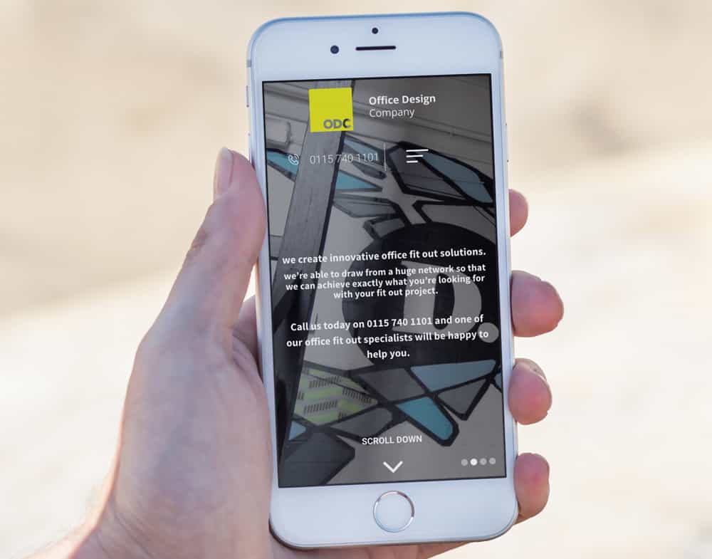
The ultimate aim for creating a responsive website is to display the same information that appears on your desktop on a mobile device without compromising the quality of design.
You’ve no doubt come across websites that aren’t responsive; when you have to pinch your screen to zoom in and adjust the site in a cumbersome way, just to read a few details. The experience isn’t great and that’s why businesses are actively working on their sites to ensure usability on a smartphone or tablet is excellent.
What’s the difference between a mobile design and a responsive design?
A responsive design requires you to have a single website which adapts to suit all devices. However, a mobile design is a separate entity, meaning you’ll have another separate site designed for mobiles.
Although many businesses adopted mobile design originally, responsive is now by far the way forward and here are our reasons why:
1. Google’s 2015 algorithm update (otherwise known as Mobilegeddon)

Back in April 2015, Google released a pretty significant update designed to make mobile friendly websites rank highly in search results. Although the change didn’t cause non-responsive sites to de-rank dramatically, it did show that Google were starting to prioritise mobile, this update was dubbed Mobilegeddon.
Since then, Google have continued to focus on mobile and the search engine giant is now adopting a mobile first update which could change the game significantly. Something that you’ll need to be careful of with this update is if your mobile and desktop pages are significantly different. Google will treat your mobile site as the primary version and if it has significantly less information than your desktop site, it could really impact a user’s first impression. Another reason why responsive design is the way forward.
2. It’s more efficient
If you currently have a separate mobile and desktop site then you’ll no doubt have two SEO campaigns running for each. However, if you make your desktop site mobile responsive then you only have to take care of one SEO strategy, making it much easier to manage.
You should, however, bear in mind that mobile searches are often different to desktop searches. For example, if you’re out and about in a new city and decide to look for a restaurant, the search terms you use would most likely be different to if you were sat at home. You’d probably use phrases like ‘nearby’, ‘close to…’ or ‘in the centre of…’. You get the jist. So, it’s important when building a single SEO strategy for your responsive site that you also incorporate search terms that would be used on desktops and mobile devices.
4. You’ll cut down costs
It goes without saying that two websites cost more than one. Having a separate mobile and desktop site will need double the maintenance. That’s where a responsive site comes in. You can channel all of your website budget into a single site making it much more cost effective.
If you have two sites, users will also require two web addresses – which means more hassle for them. Are they likely to seek out a competitor with one simple, straightforward domain? Maybe. So it’s not only important for keeping your budget down but also for avoiding losing business
5. User experience is key

Think about your bounce rate with this one. If users land on your site and it’s not optimised for mobile, making it difficult to use, there’s a high chance they’ll leave. In fact, according to Google, there’s a 61% chance that a mobile user will leave your site if they can’t see what they’re looking for or find the experience frustrating.
Therefore, getting user experience right is key. You want mobile users to find exactly what they need when landing on your site with no hassle. Building a responsive site will help ensure your users are presented with a site that’s easy to navigate – leading to a reduced bounce rate.
6. It’s mobile first with blogging and social media

If you have a blog that you push out on social media, it’s likely that you’ve seen an increase in mobile traffic. A study by ComScore found that 55% of social media usage is on a mobile device. Therefore if you’re blogging regularly and want to attract users to your site then it’s crucial that you have a responsive design, capable for accommodating those mobile visitors.
Conclusion
All in all, responsive design is really leading the way nowadays. With a pressing need to please mobile users, brands are focusing on making their sites as responsive as possible. Bearing in mind that it’s now key on Google’s agenda, it’s important that businesses adapt and move forward with the updates. If you would like to see how your site currently measures up, take Google’s simple mobile friendly test.
