2020 is something that a lot of us will want to put behind us, but before doing so we need to know how to improve in the months to come. We need to look at the few positives we can take from the last year and move into 2021 with new hope and fresh expectations.
Design will always be evolving and changing but the best way to improve is through reflection. Hopefully, you can think of something positive you can take from this year and bring it into 2021.
Let’s have a look at what new things can be expected in 2021 Websites Designs.

1. Voice-activated Interfaces
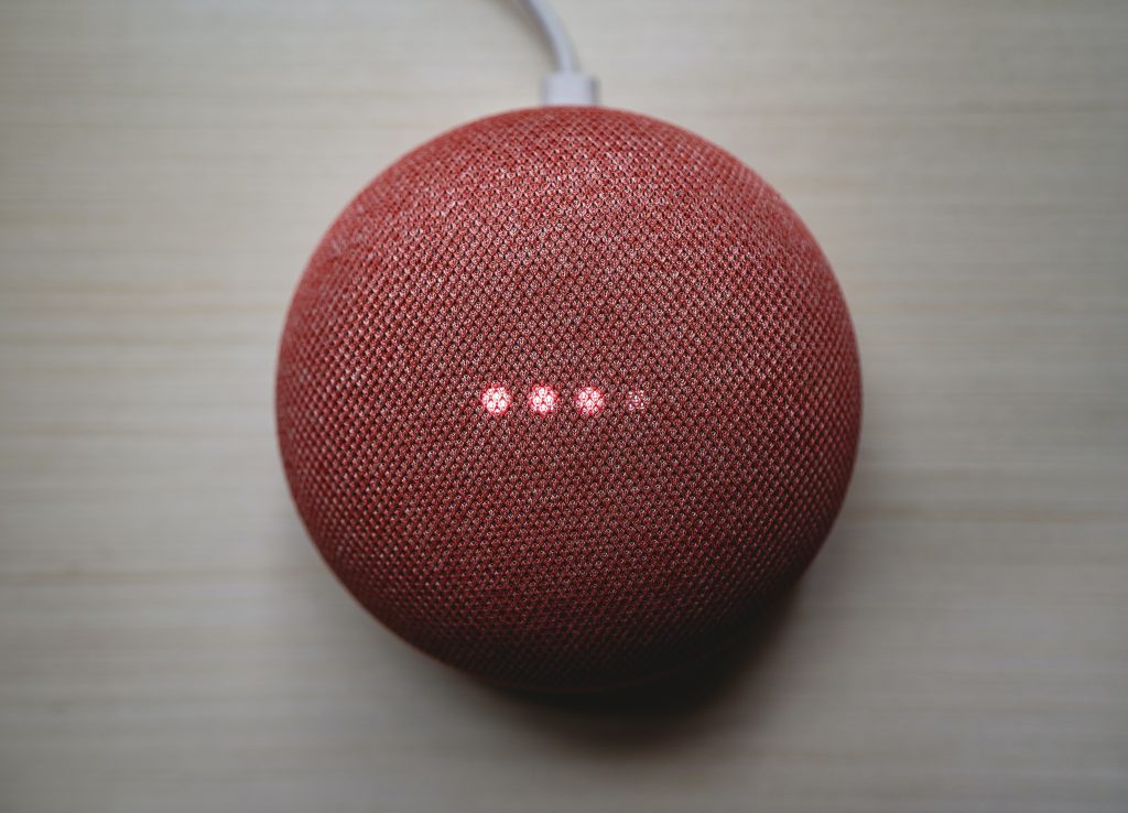
The recent impact of higher quality voice integration into our day to day lives such as smart speakers in our households has begun a new trend that we’ll be seeing integrated into 2021 website designs. Including this into a modern 2021 design will be meeting our new expectations of being able to ask questions or demand information with little effort.
We will see voice search takeover the traditional text search, modernising a website to have this will show the users and competition you are ahead of the game. It will also be included in chatbots, as they are becoming more and more humanoid to provide a better experience for the user. Speaking into the chat will only improve the flow of the user experience, which should always be a goal from a UI/UX position.

2. VR Experiences & Capabilities
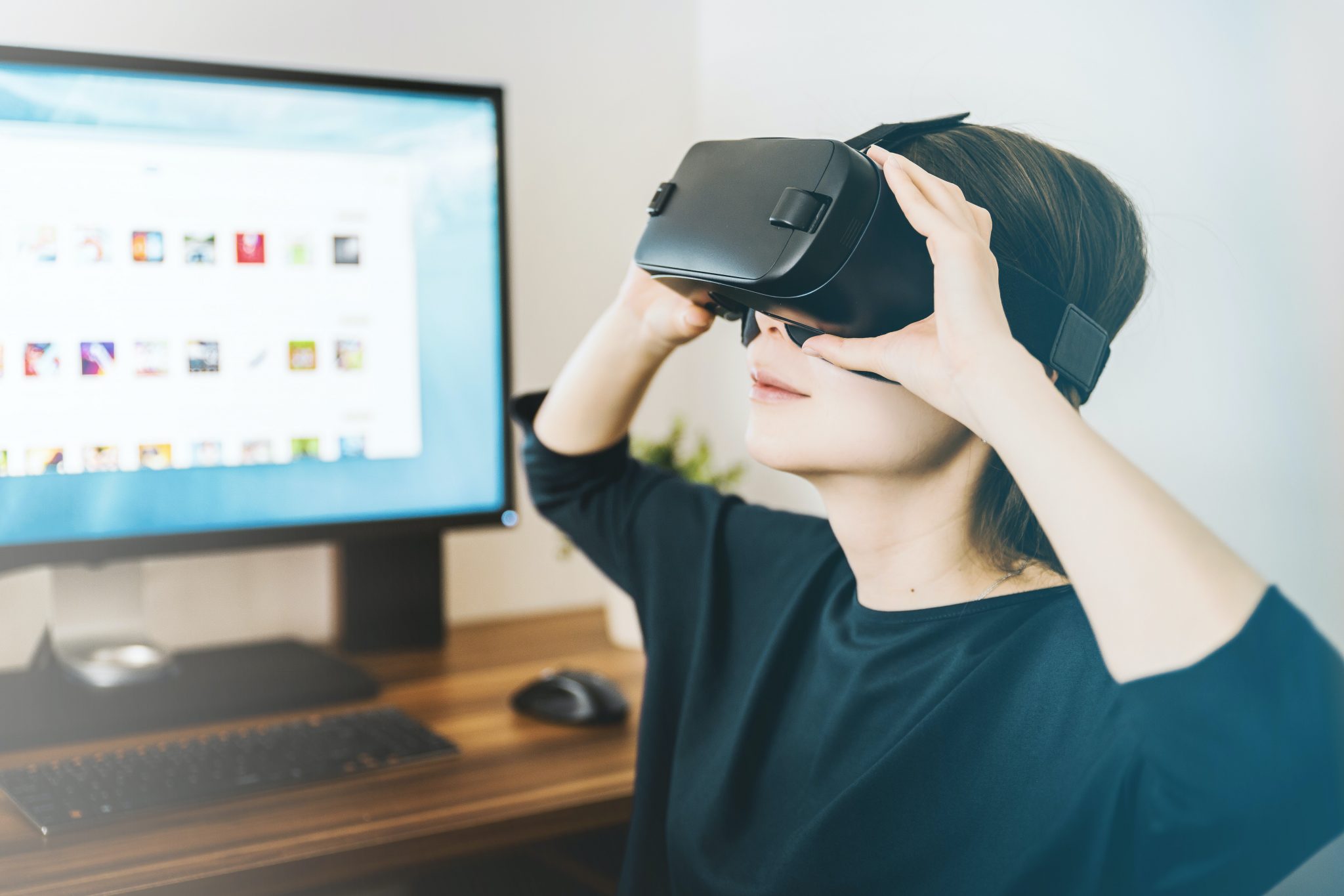
VR is usually related to gaming but its capabilities are being used in jobs you wouldn’t have thought of. It’s now seeping into flagship websites, but how is it being used? The main way it is being integrated into websites is through mobile versions.
An example of this, you may be checking out a new piece of furniture but you’re unsure if the size is right or the colour might not match the room. Now you can place it in your room before buying it through VR and the camera of your smartphone. Top websites like Amazon are offering this capability for companies to use, which will only improve business.
3. Impactful Heros
It’s nothing new that your Hero should create an impression on the user as they load your website, it’s the first thing they see and first impressions are everything. To have an impactful Hero when in 2021 you’ll be seeing a range of Text-only Heros, clean, clear and professional. Other styles that have been incorporated recently are full-size images that include large organic graphics integrated into the image. Organic or fluid shapes are anything that doesn’t involve straight lines.
Including Organic shapes into your images gives a depth of interest, engaging the users to feel the characteristics the site has to offer. It also provides the company with another way to show off their branding, sharing the style of persona a company may have.
4. 3D Content
High standard 3D content will always be impressive to users, it gives depth to a website and adds that extra finesse. What will 2021 bring in terms of new 3D content for websites though? We will see it in smart videos, they’re engaging and one of the most effective online marketing tools. Maturing technology and designers pushing boundaries has allowed us to see interactive 3D content appear on websites, captivating users with the experience it provides.
Due to the popularity of VR / AR technologies design has gained the momentum to have a bigger impact on 3D elements. These big impacts can come at a cost with how large the file sizes are with each design feature, so don’t forget about fast loading speeds as well.

5. Colourful Minimalism
Every website you go on is trying to draw you into its experience, what’s better at doing that than the use of colour? Minimalism will always provide a clean, clear and luxury experience but what happens when you combine the two? Well, that’s what people have started doing and the results are very impressive. Websites come across in an elegant characteristic experience providing clarity with personality, it works brilliantly.
Using bold colours in minor ways to have an impactful result is a combination that will be taken into 2021 and used in some very fun but intriguing ways. By using vibrant and contrasting colours you can give a powerful first impression, leaving an imprint in the user’s minds, a website they won’t forget.
6. Micro Animation
Subtle but sweet, Micro animations bring your work to life and raises the standard of your website, bringing depth and interest to it. Having these minimal animations provide character and can show an action that’s about to be taken, such as hovering over an icon or after pressing a button.
Incorporating small elements as micro animations have already started to begin before 2021 hits but when we break into the new year we’ll see them used because they’re super effective. However, less is more and a user won’t want to be bombarded with too many of these animations, just key parts to the site will provide a great experience.
7. Asymmetric Designs
Breaking the boundaries, we’re comfortable and happy with seeing a grid. It’s the most common layout for a website, it provides an easy structure that is used in all ranges of design. However, the boundaries are beginning to break more and more with different types of layouts, a favoured one for 2021 is Asymmetrical design.
This type of layout provides a designer with a lot more creative freedom with elements not following your general grid layout. It is still important to find the correct balance, no part of the website design should look heavier than the other. By changing the layout from a common style you give a user an experience they may not have had before, which can cause a larger impact in remembering it over competitors websites.
8. Availability & Accessibility
Desktop websites provide a brilliant size for creative freedom, however, now designs generally have to be prioritised for smartphone screens. We are moving into 2021 shortly so if you didn’t realise this where have you been living? Thumb navigation is 2021, making the key elements of a site accessible with a reach of a thumb across the screen. Take your time in testing your designs, get different people to experience the positions of buttons, navigations and dropdowns, just to name a few.
As well as making sites accessible through smartphones, we as the modern generation are impatient and have high expectations. If your website loads slowly, videos buffer or animations aren’t smooth then this will cause a negative experience and will lose peoples interest or business with you. The experience needs to be fluent and fast, no blips on the way.
Summary
We are going to have new looks, intriguing content but most importantly reinspired content from the past, it always makes its way into each new year’s designs. If you are reading through any of these new features and styles but know your website is falling behind, don’t let your competitors beat you to it!
Get in touch with us today on 0115 971 8908 and let us begin a new project, making your website the flagship that others want to be like. We cover areas including Derby, Nottingham, Leicester and Sheffield!
